
Circlua
FUTUREBRAND
2023
Problem:
Cities around the world are growing at a fast pace. Imagine that in 1980 there were 4.43 billion people. Now, there are 7.75 billion, according to the World Bank. such growth requires water, food, and, in particular, construction.
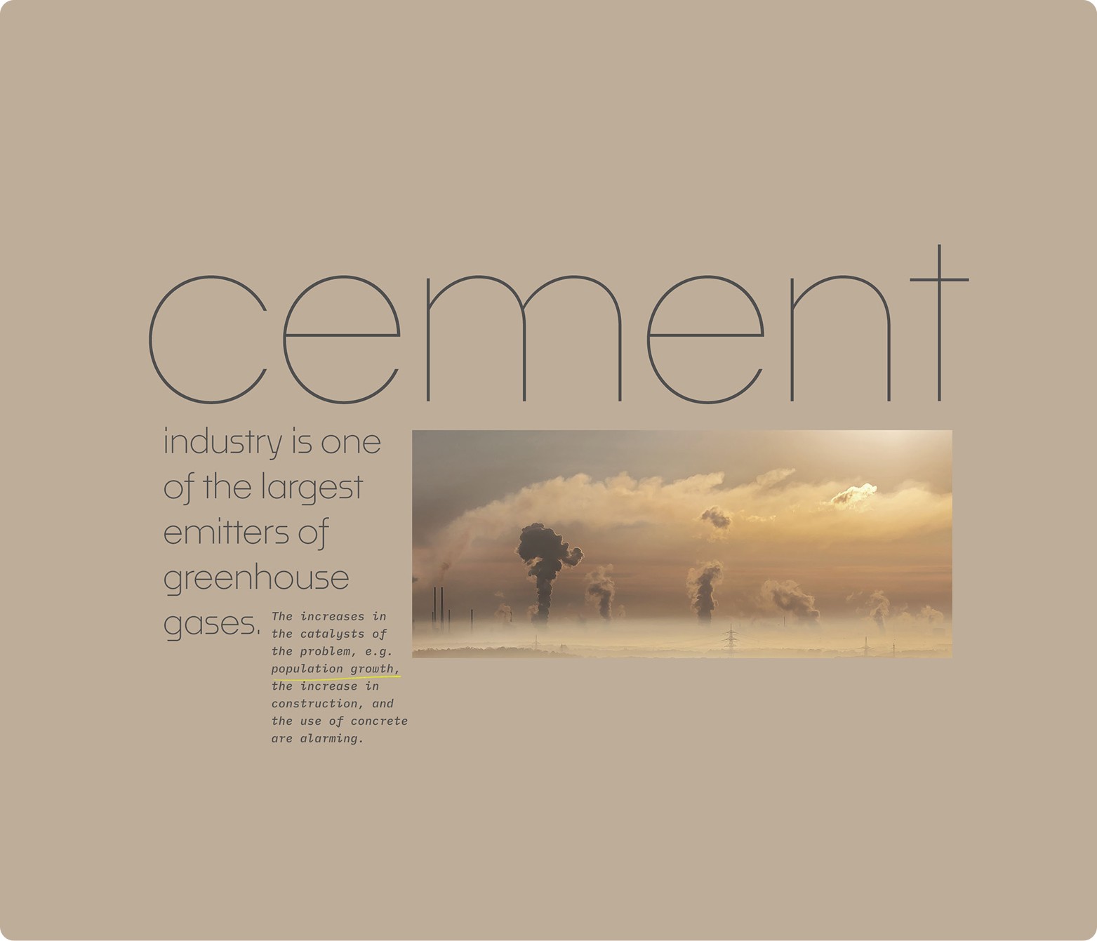
According to the BBC, in 1970, cement consumption was around 500 million tons per m3. Today, this figure has skyrocketed by 900%, which means 4500 million tons per m3. And the most astonishing: according to studies, after water, concrete is the most used substance on the planet.
But current construction, more than anything else, use cement and concrete as a base – materials that, unfortunately, are also at the top of the ranking of those that most emit carbon in their production processes.
It is evident that the challenge is as great as it is urgent. Therefore, intelligence, will, and purpose are needed to seek solutions that generate an equivalent positive impact.
From this thought, Circlua came to life. The company with the ambitious – and extremely necessary – purpose of fostering conscious development, transforming mining waste into solid sustainable value and, consequently, helping the entire construction industry to evolve.

Solution:
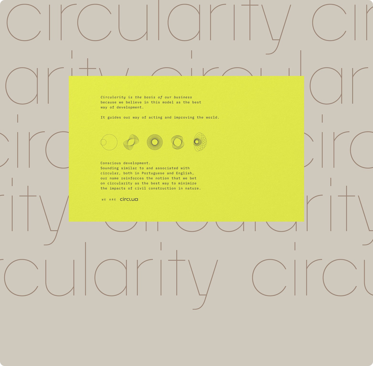
Circlua came to life, a company that has circularity as its business foundation and as a path to conscious development.
The name Circlua was created to transmit, at first sight, the company's belief in a circular economy as a way of thinking and acting. besides that, it sounds different in portuguese and english, reflecting the team's own disruptive and innovative characteristics.
Brand:
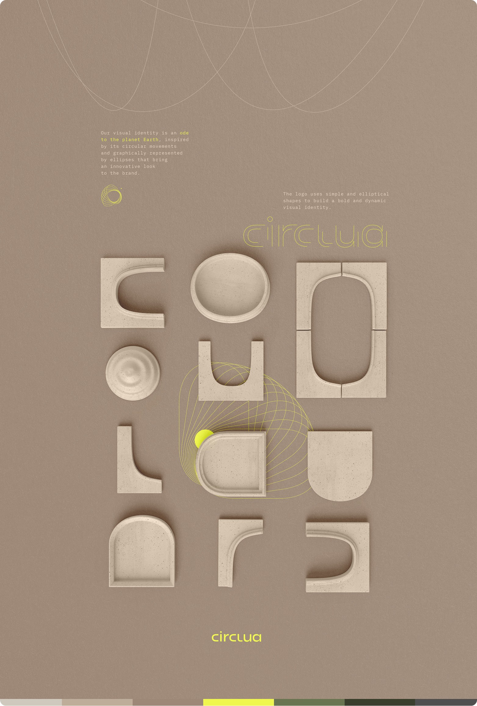
The visual identity expresses the view of someone who is absolutely committed to taking care of the earth. after all, if we want our home to be strong and lasting, we need to take care of the planet where it is (the only possible home so far).
Therefore, the earth occupies the center of this visual universe. from that comes the inspiration for the ellipses, which graphically represent the movements of translation and rotation, bringing dynamism, but also – literally – circularity.
These graphics, drawn in simple and objective strokes, add sophistication and technology to the brand's expression.
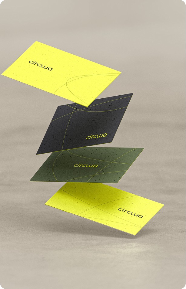
Naturally, the logo was designed in the same elliptical shapes as the graphics, conveying the brand's values – circularity and care for the planet - through the main point of visual contact.
Color scheme was also inspired by nature with earth tones ranging from green to earthy brown, contrasting with a powerful lime green that creates highlight points and brightens the picture.
The photographic style was chosen to be sunny, natural, and full of life. nature texture pictures were also used to show awareness of the beauty of the materials – either in a raw state or used, the latter for Circlua being of great value. after all, the best raw material is one that is already in use, ready to be recycled.


Strategy Director: Filippo Vidal, Isabel Sobral
Creative Director: Arnaldo Bastos
Design Director: Pablo de Vivo
Design: Guilherme Silva
Strategy: Gabriela Nobrega
Verbal identity: Luisa Borges
Account: Thamires Crepaldi
